Color management may not be on the radar of new photographers, but it’s a crucial part of the process, especially once you start printing your images. Whether you’re printing at home or using a professional service, you might have experienced the frustration of receiving prints that don’t match what you saw on your screen—whether they were too dark, had an odd color cast, or were overexposed. This discrepancy is where color management comes into play.
Let’s break down why color management is so vital and why it doesn’t have to be as daunting as it sounds.
Understanding the Difference Between Devices
When you view your photo on a computer monitor, you’re not seeing the actual scene as it appeared to your eyes. Instead, you’re looking at a digital representation of the image that was captured by your camera. Your camera processes the light into digital data, storing it in a file with colors that are encoded into a specific color space.
Color spaces, such as sRGB and Adobe RGB, define how many colors can be represented in your image. Ideally, if you use the same color space from capture to output, the colors should remain consistent. However, that’s not always the case. Your monitor, for instance, might not be displaying the colors correctly unless it’s calibrated to do so.
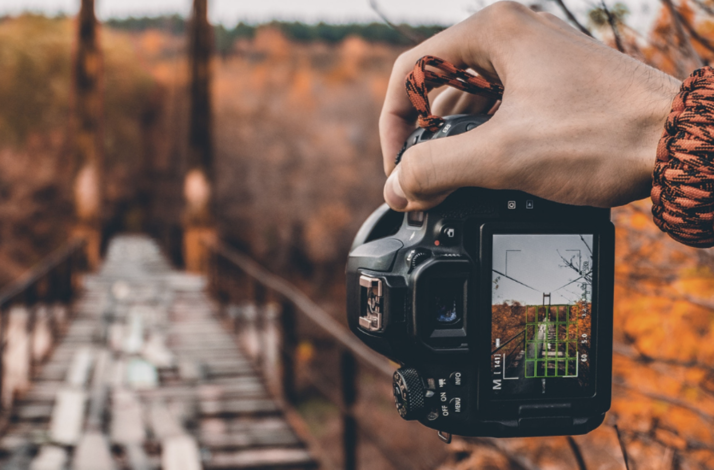
Starting with the Camera
Color management starts at the very beginning: with the camera. Modern cameras typically allow you to shoot in either sRGB or Adobe RGB color spaces. Adobe RGB has a wider gamut, meaning it can capture a broader range of colors. As a result, you should almost always set your camera to Adobe RGB for better color accuracy.
Finding this setting will vary depending on your camera model, but it’s generally located in the image quality or shooting settings section. Some cameras may also offer other color spaces, but Adobe RGB is usually the best choice.
Why Monitor Calibration is Critical
The monitor you use to view and edit your photos is key in ensuring your colors are accurate. Every monitor displays colors differently, and factors like brightness, contrast, and color settings can significantly affect how an image appears. Additionally, monitors intended for everyday use might not be ideal for photo editing, as they may not be calibrated for true color accuracy.
Furthermore, monitors have different capabilities in terms of color reproduction. Budget models may only display 90% of the sRGB color space, which means you’re not seeing the full range of colors your camera captured. A higher-quality monitor will cover more of the color gamut, giving you a more accurate preview of your images.
The lighting in your editing environment also plays a role. A well-lit room with harsh fluorescent lights can make your images look different than they would in a dark, dimly lit room. This is why calibrating your monitor regularly is essential for achieving consistent color results.
How to Calibrate Your Monitor
The best way to ensure your monitor is displaying accurate colors is by using a monitor calibration tool. These devices, which aren’t prohibitively expensive, measure the colors on your screen and help adjust your monitor to the correct color space. When you run a calibration program, the tool will flash primary and secondary colors on your screen and adjust your monitor’s settings to align with those colors.
More advanced calibration tools can even account for environmental factors like ambient lighting and adjust the display on the fly to maintain color accuracy. Tools like the Datacolor Spyder X are popular choices among photographers for keeping their monitors in check.
Beyond the Camera and Monitor: Editing and Output Color Spaces
After capturing and viewing your image, the next step is editing. If you use Lightroom, the software automatically works in Adobe RGB, so as long as your camera is set to Adobe RGB and your monitor is calibrated, you’re good to go.
For Photoshop users, you’ll need to configure the color settings based on your specific workflow. The final stage is outputting your images. If you’re sending your images to a print lab, you’ll most likely be working in the sRGB color space, as that’s the most widely used for printing and online displays. You can proof your image in this space before outputting to ensure the colors stay true.
Managing Color When Printing
Things get a bit more complicated if you’re printing your photos at home, especially if you’re using a professional-grade printer. Printers require specific color space information to produce accurate results. Most high-end printers use either sRGB or Adobe RGB, but ink types, paper choices, and printer models introduce another variable. To account for these, professional-grade printers use ICC profiles, which provide a color map for specific paper and ink combinations.
If you’re using advanced software like Photoshop, you can import ICC profiles for your printer and paper, allowing you to proof your images before printing. This ensures the colors in your final print match what you see on your screen as closely as possible.
Summary: Simple Steps for Accurate Color Management
Color management may seem complex, but following a few simple steps can help you achieve consistent and accurate colors in your images:
- Shoot in Adobe RGB: Capture your images in the widest color space possible for richer colors.
- Edit in Adobe RGB: Use the same color space when editing to maintain color accuracy.
- Invest in a Good Monitor: Buy a monitor with a wide color gamut and use a calibrator to ensure it displays colors correctly.
- Calibrate Regularly: Calibrate your monitor before editing sessions to maintain consistency.
- Output in sRGB: For most print labs and online use, output your images in sRGB to ensure compatibility.
By following these guidelines, you’ll minimize color discrepancies and produce photos with consistent, vibrant colors—without needing to dive too deep into the complexities of color science.